•A logotype is a graphic mark or emblem commonly used by commercial enterprises, organizations and even individuals to aid and promote instant public recognition.
•A logotype is commonly known as a logo.
•Logotypes can be used as a language like the Egyptian Hieroglyphics.
•Used on coats of arms, like a shield or flag
•In the 18th and 19th century the use of logotypes were booming in the advertising industry.
•Logotype has expanded now being used to as decoration as a artistic, storytelling nature.
•By 1890 the US had produced 700 lithographic printing firms that employ over 8,000 people.
•By 1950 the Modernism had come to life in logotype, that is a avant-garde artistic movement in Europe and soon became international.
•Modernist logos are successful in an era of mass virtual communication that has come by television, improved printing technology, and lastly digital innovations.
•Logos need to be simple, but also be able to stand out from others.
•Modernism made logos simple and clear.
5 Principles of Effective Logo Design
•Simple
-Makes the logo easily recognizable, memorable, unique
•Memorable
-Keeping the design simple yet appropriate
•Timeless
-Should be able to be affective in 10, 20 years
•Versatile
-Works across a variety of media and applications, should be in vector format
•Appropriate
-Logo should be appropriate for the audience/client not you
Spot Color
Method of specifying and printing colors in which each color is printed with its own ink. Spot color printing is effective when the printed matter contains only one to three different colors, but it becomes prohibitively expensive for more colors.
Pantone Matching System
It is a system by the company Pantone, every printer uses these inks. World wide these colors will be used this system in printers.
Choose your own color
-Color plays an important role in logo design. Color can illicit different feelings and emotions from the audience.
-Interpretation of color may vary depending on age, gender, and cultural demographics. So color should be carefully considered based on your target audience
-Colors also tend to follow trends, like fashion
-Keep your color palette to two or three
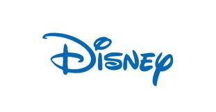
Iconic/Symbolic
-Icons and symbols are compelling yet uncomplicated images that are emt/ematic of a particular company or product
-Nike
-Disney
-Apple
Wordmark/Lettermark
-Incorporates your company or brand name into a uniquely styled type font
-Word is the full company name
-Disney
-Letter is initials
-NASA