Thursday, May 17, 2012
Tuesday, May 8, 2012
Research and Inspiration #20
Biography
Frank Shepard Fairey was born on February 15, 1970. Graduating from Idyllwild Arts Academy in 1988, then in 1992 he graduated from Rhode Island School of Design. Coming out with a Bachelor of Fine Arts in Illustration, he started off his career. The artist is a American contemporary graphic designer as well as a illustrator, who came from the skateboarding scene. The first major piece that he did was named "Andre the Giant has a Posse" for the company OBEY. Frank because famous after doing his Barack Obama "Hope" poster, after the lawsuit that had occurred afterwards.
Frank Shepard Fairey was born on February 15, 1970. Graduating from Idyllwild Arts Academy in 1988, then in 1992 he graduated from Rhode Island School of Design. Coming out with a Bachelor of Fine Arts in Illustration, he started off his career. The artist is a American contemporary graphic designer as well as a illustrator, who came from the skateboarding scene. The first major piece that he did was named "Andre the Giant has a Posse" for the company OBEY. Frank because famous after doing his Barack Obama "Hope" poster, after the lawsuit that had occurred afterwards.
Research
Social Issue:
A social issue is when something in the modern day is an issue/problem. Take for example a corrupt leader, that leader is a social issue because of the problems that they are causing. It can be narrowed down to a certain person so a world wide problem like global warming.
Colors:
Black and white are widely used no matter what social issue, both can be used to convey many different emotions.
Trends:
Politics plays a major role in todays social issues, a lot are talked about and are from politics. Environmental issue are a very big one that is commonly talked about that is used.
Words:
Emotions are commonly used like "hope", "hate", "desire" these can get people easily wrapped in emotion. Some words that have a lot of meaning behind them like "poverty" or "divine".
People:
People that are generally used in Social Issue logos are usually very inspirational people, charismatic, or someone that can evoke emotions out of people that will inspire them or feel the emotion behind the design.
Graphics:
 |
| The leave is resembling life and the dirty hand is holding up the leave in a way that it is keeping the leave alive. |
 |
| The blood dripping from the gun resembles the blood the bullet will draw from the trigger being pulled. |
 |
| The image above is a raindrop that is almost empty but for the very bottom. It is about the droughts all around the world and how some people don't have enough water than what they should have. |
Monday, May 7, 2012
Tuesday, May 1, 2012
Research and Inspiration #19
Business card

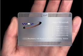
The business card above is clear with black lettering, it will stand out from most cards because of it being clear and original

The card is metal that on the top and bottom has a tiny hole pattern to stick out from other business cards. Using it's logo to stand out even more with the blue/orange color.

These cards are not the average shape that most business's cards use and will be looked at before another business card. With the black lettering and the green logo it looks better and stands out
- Bold colors are used often
- Black or white are commonly used as a the background color
- The companies logo is commonly incorporated into the business card
- Most cards are rectangles and/or have rounded edges
- Google has the search bar and logo as a business card which is very popular
The business card above is clear with black lettering, it will stand out from most cards because of it being clear and original
The card is metal that on the top and bottom has a tiny hole pattern to stick out from other business cards. Using it's logo to stand out even more with the blue/orange color.
These cards are not the average shape that most business's cards use and will be looked at before another business card. With the black lettering and the green logo it looks better and stands out
Stationery Package
The printed pieces that a company utilizes for communication purposes
When est a business, it is very important that all communications are well coordinated and that the message of the organization is presented consistently
Includes BUSINESS CARD, LETTERHEAD, and ENVELOPE
The Business Card
An essential part of a stationery design. When you hand someone your business card, they will form an immediate opinion about your company. Your business card does more than tell people how to find you: it says something about your company- its mission, its culture, and its goals. Everything for the colors, fonts, the texture, shade and gloss of the paper you print on says something about you.
Typically a business card includes:
Logo
Company Name
Employee Name
Title
Phone number
Fax number
Email address
Company address
Web address
Tips:
2" x 3.5"
Horizontal or vertical orientation
check for accuracy
check for unity...continuity among other pieces
typical margin is .25" to .125"
Letterhead
A printed piece of paper used to send letters, memos, ect.
Typically includes:
logo
company name
company address
phone number
fax number
web address
Tips
Must be 8.5" x 11"
Must be vertical orientation
Must leave room to write the letter, memo, ect- big empty space in middle
Check for accuracy
Check for unity, continuity among other pieces
Envelope
the packaging the contains the letter/form when being mailed. Standard #10 envelope
Typically includes:
logo
company name
company address
Design tips:
must be 9.5" x 4.125"
horizontal or vertical
must leave room for recipient's address or stamp
check for accuracy
check for unity, continuity among other pieces
Subscribe to:
Comments (Atom)


